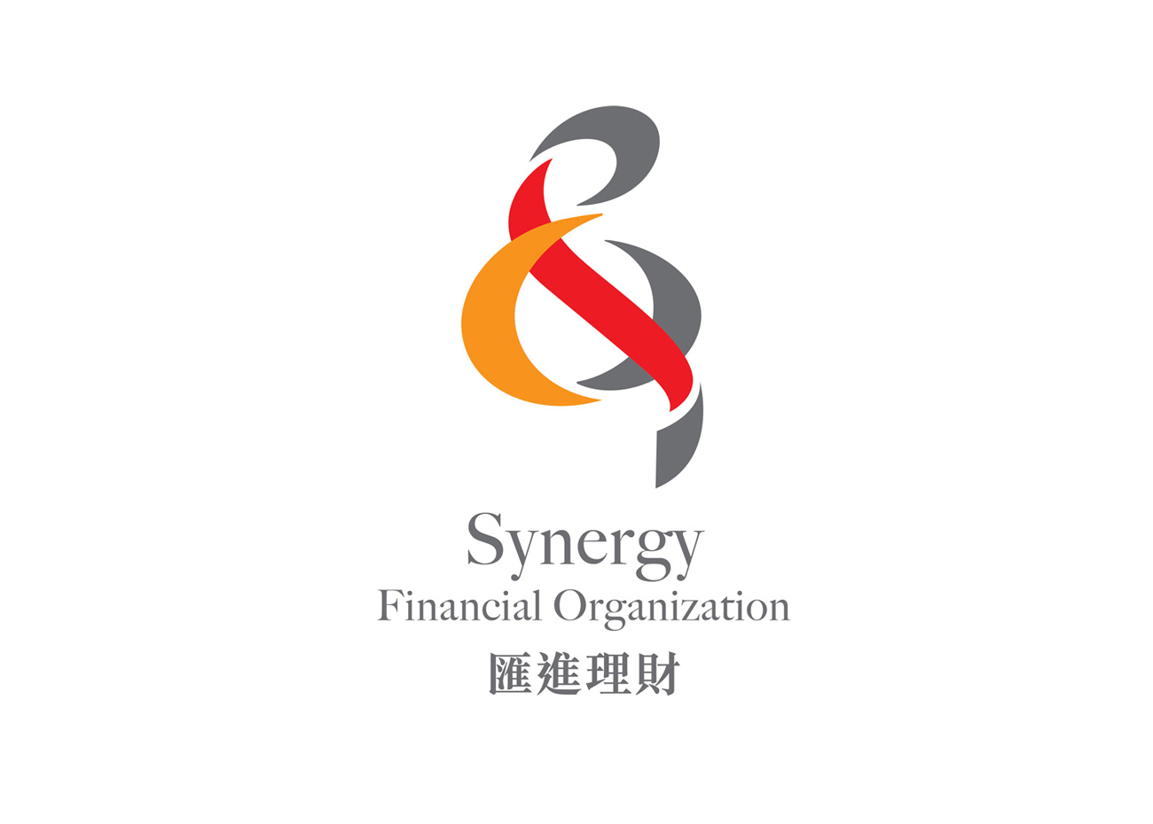

Synergy Financial Organization (SFO) is an agent unit within Prudential. With around 400 staff members, the unit has been providing a variety of professional financial services for over 30 years. A new logo was designed to help distinguish them from other financial units; strengthen team spirit, increase brand awareness and self-identification. It has to project maturity yet be dynamic to convey the unit’s 4P core values of Professional, Pro-active, Production and People-oriented. An ampersand (&) is formed using the initial characters of “S” Synergy, “F” Financial and “O” Organization to represent the corporate’s mission of growing, caring and sharing together with clients and colleagues. Ideal as this punctuation mark originated as a ligature of the letters et — Latin for “and”, encompassing the agency’s vision of togetherness.
Info
Category:
Financial ServiceClient:
Synergy Financial Organization